FinTech Admin Dashboard
A clean, data-driven admin dashboard UI designed for a FinTech SaaS platform with user management, asset tracking, and transaction monitoring.
Dashboard Overview
Main dashboard with KPIs, performance trends, and recent transactions.
Project Overview
Dashboard Overview with KPIs
Stocks & Assets Tracking
Transaction Management
User Management System
Dark Theme UI
Technologies
Project Type
FinTech SaaS Admin Dashboard
Project Description
A clean, data-driven admin dashboard UI designed for a FinTech SaaS platform. This project simulates a real-world back-office tool for managing users, assets, transactions, and system metrics — all within a responsive dark theme.
The dashboard provides a comprehensive view of the platform's performance, user activity, and financial data, making it an essential tool for FinTech administrators and managers to monitor and manage their operations efficiently.
🔧 Features & Sections
Dashboard Overview
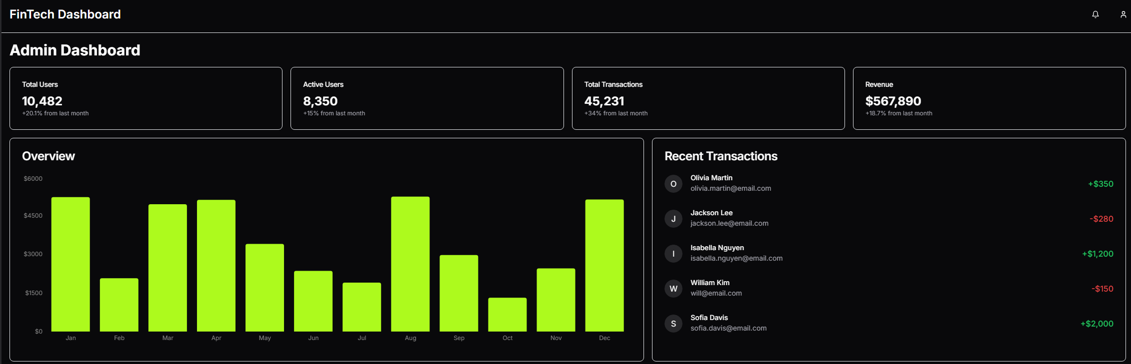
- Real-time stats: Total Users, Active Users, Transactions, Revenue
- Bar chart showing recent performance trends
- Recent transactions with value indicators (green/red)
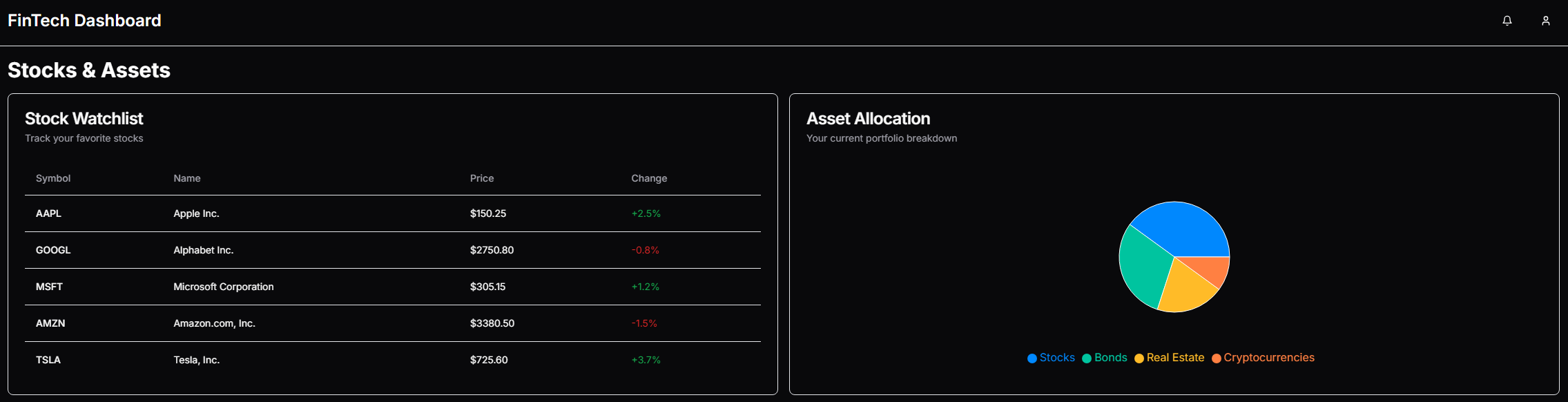
Stocks & Assets
- Stock watchlist with live pricing
- Asset allocation display for portfolio breakdown (categories like Stocks, Bonds, Real Estate)
- Performance indicators with color-coded changes
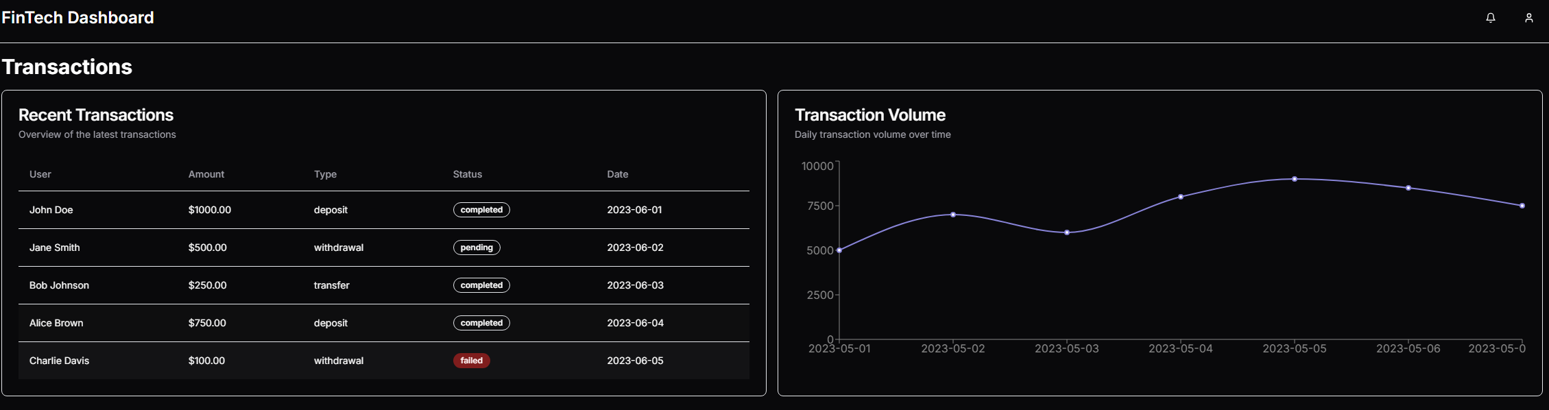
Transactions
- Recent user transactions with detailed information
- Transaction volume line chart showing daily activity
- Status indicators for completed, pending, and failed transactions
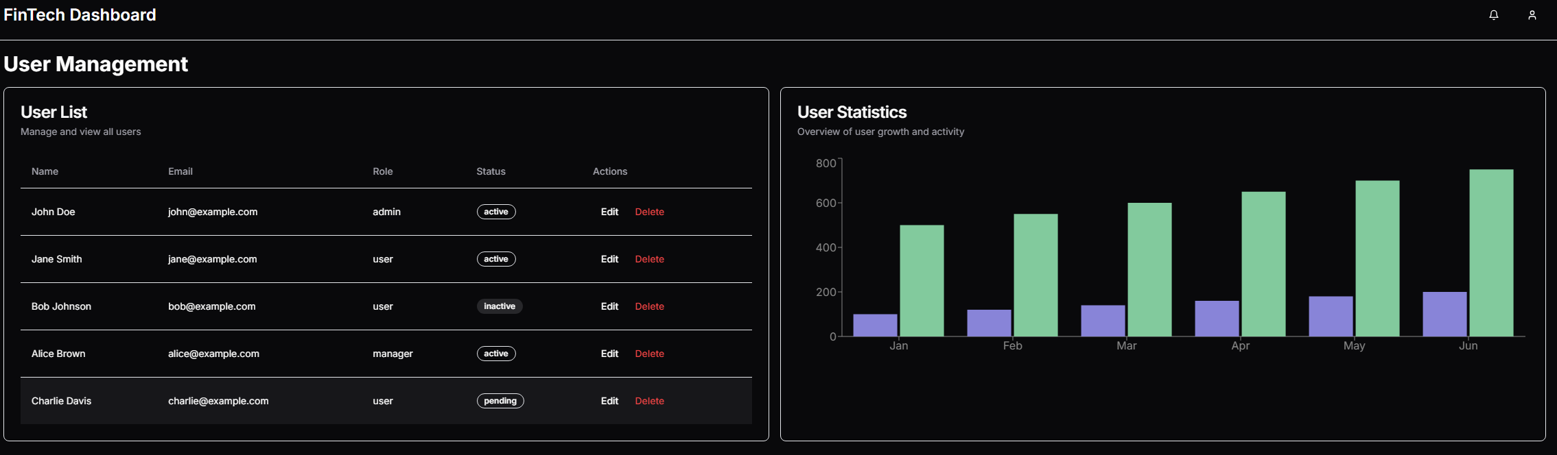
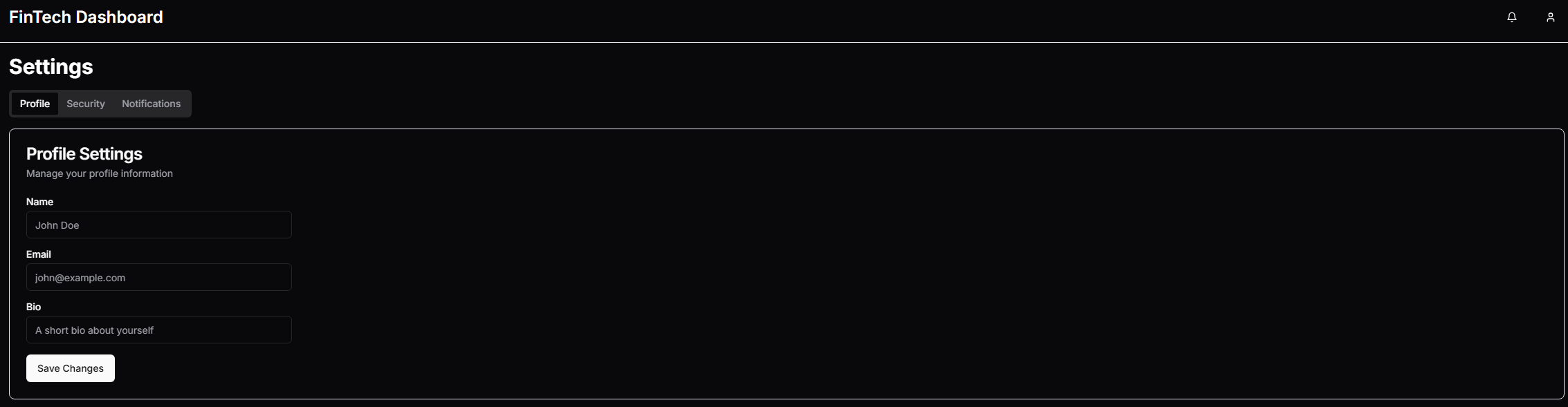
User Management
- User list with names, emails, roles, and status
- User activity and growth stats displayed via dual-bar chart
- User management actions (edit, delete)
👨💻 What I Did
- Used a public V0 layout as the foundation
- Fully customized the dark theme, layout, and spacing to match real FinTech aesthetics
- Integrated multiple reusable UI components to simulate a functioning admin tool
- Connected dynamic chart components using Chart.js for responsive visualizations
- Structured the routing/navigation with clean sidebar UX
- Ensured everything is responsive and works beautifully on mobile/tablets
🎯 Project Goals
- Demonstrate ability to build full admin UIs with professional structure
- Showcase dashboard layouts commonly used in SaaS, FinTech, or internal tools
- Practice handling dynamic data displays and layout consistency across routes
- Create a visually appealing dark theme optimized for financial data visualization
Technical Implementation
Dark Theme Design
I implemented a custom dark theme optimized for financial data visualization, with careful attention to contrast ratios and color psychology. The dark background reduces eye strain during extended use while making charts and data points more prominent.
Data Visualization
Using Chart.js, I created responsive and interactive charts for displaying financial data, including bar charts for performance trends, line charts for transaction volume, and pie charts for asset allocation. Each chart is optimized for clarity and readability.
Component Architecture
I built a modular component system with reusable elements like data cards, tables, and status indicators. This approach ensures consistency across the dashboard while making the codebase maintainable and scalable for future enhancements.
Responsive Design
The dashboard is fully responsive, adapting seamlessly to different screen sizes from desktop monitors to tablets and mobile devices. I implemented a collapsible sidebar and responsive grid layouts to ensure optimal viewing experience across all devices.
Dashboard Sections
Dashboard Overview
The main dashboard provides a comprehensive overview of the platform's performance with key metrics displayed prominently at the top. The KPI cards show Total Users (10,482, up 20.1%), Active Users (8,350, up 15%), Total Transactions (45,231, up 34%), and Revenue ($567,890, up 18.7%).
Below the KPIs, a bar chart visualizes monthly performance trends, allowing administrators to identify patterns and make data-driven decisions. The Recent Transactions section on the right displays the latest user activities with color-coded indicators for transaction values, providing immediate insight into financial movements.
Need a custom dashboard solution?
I can help you build tailored admin interfaces and data visualization dashboards for your business needs.