Userlytics Analytics Dashboard
A full-featured admin dashboard designed to mimic a real SaaS analytics platform.
User Stats Dashboard
Overview of key user metrics and growth statistics.
Project Overview
Modular Dashboard Sections
Interactive Data Visualizations
Custom Dark Theme
Responsive Layout
Tabbed Navigation
Technologies
Project Type
SaaS Analytics Dashboard
Project Description
Userlytics Analytics Dashboard is a comprehensive admin interface designed to mimic a real SaaS analytics platform. It includes modular sections for user statistics, performance insights, user engagement, and product feedback — all styled in a custom dark mode theme.
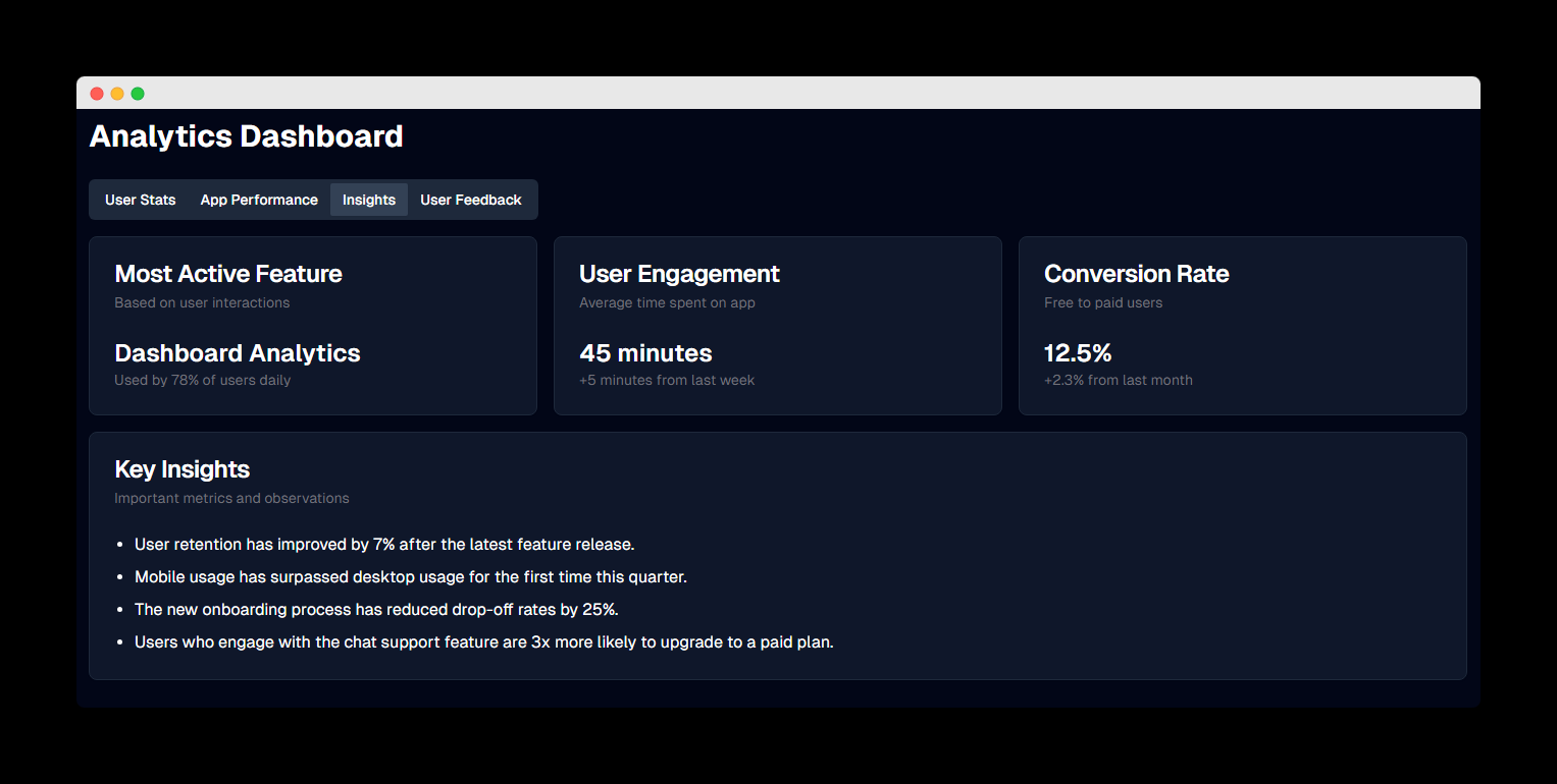
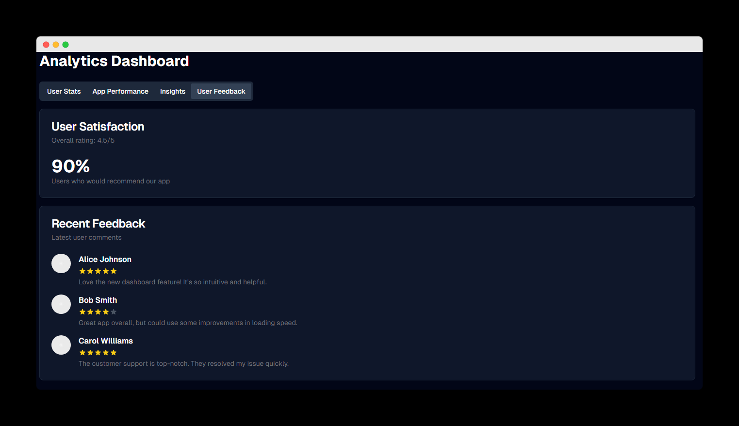
The dashboard presents complex data in an intuitive way, making it easy for product managers and stakeholders to track growth trends, system performance, feature usage, and user satisfaction in one centralized interface.
Key Features
Tabbed Navigation System
- Organized content into User Stats, App Performance, Insights, and User Feedback tabs
- Intuitive navigation between different data categories
Interactive Data Visualizations
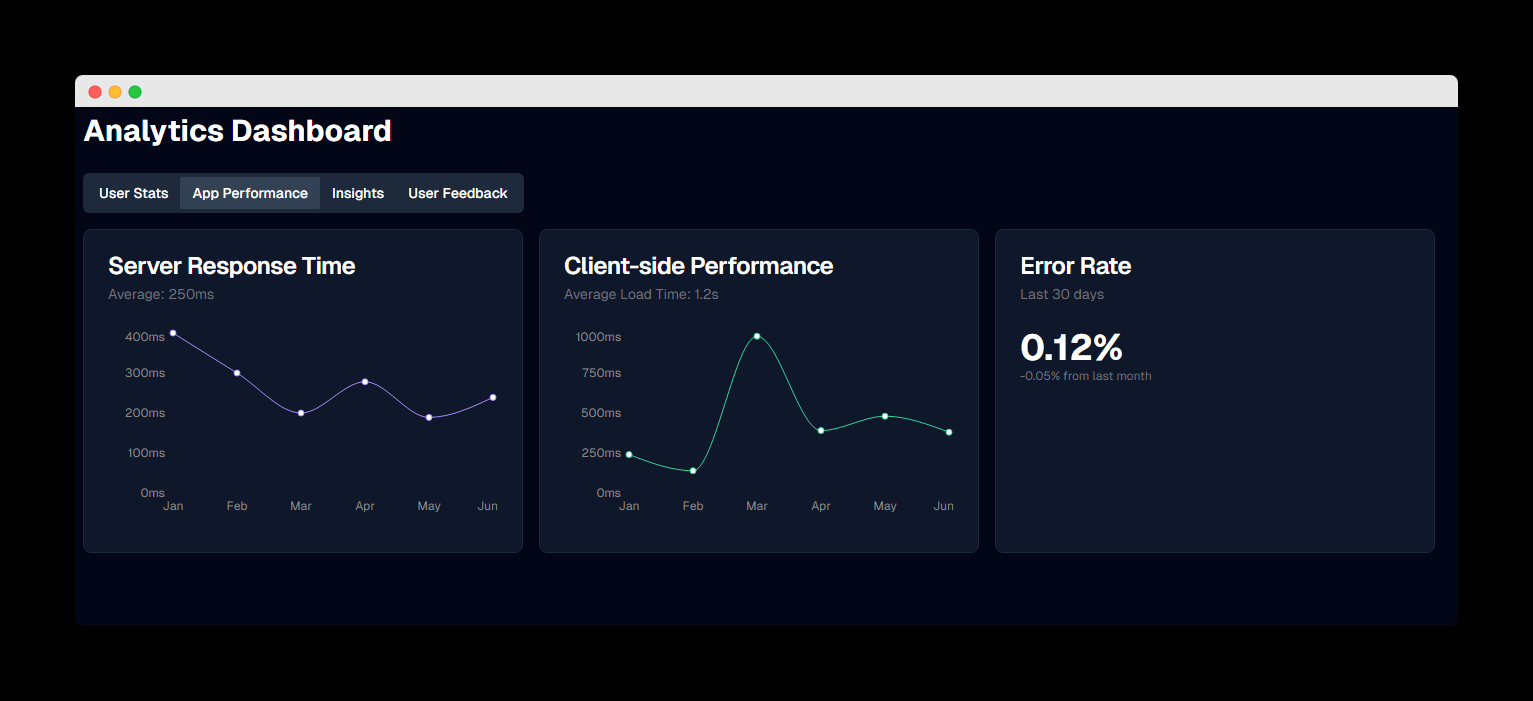
- Line charts for performance metrics and time-based trends
- Bar charts for growth visualization
- KPI cards with change indicators
Custom Dark Theme
- Designed for reduced eye strain during extended use
- Carefully selected color palette for data visualization
- Consistent styling across all dashboard components
Responsive Layout
- Adapts to different screen sizes and devices
- Optimized for desktop and tablet viewing
My Role
I started with a public layout as a base and expanded it into a fully customized, responsive dashboard with tabbed navigation, interactive chart components, and a data-driven layout. Designed to simulate a real-world product environment, this dashboard presents growth trends, system performance, and feature usage in a way that would be useful for startup teams or product managers.
I implemented all the data visualizations using Recharts, created the custom dark theme, and designed the modular dashboard components to ensure a cohesive user experience across all sections.
Project Goals
- Create an intuitive analytics dashboard for SaaS product teams
- Demonstrate data visualization capabilities with interactive charts
- Showcase modular dashboard architecture and component reusability
- Implement a professional dark theme optimized for extended use
Technical Implementation
Data Visualization
I used Recharts to create responsive, interactive charts that visualize complex data in an intuitive way. The charts are configured to match the dark theme with carefully selected colors for optimal readability and visual appeal.
Responsive Design
The dashboard is built with a mobile-first approach using TailwindCSS, ensuring that all components adapt seamlessly to different screen sizes. The layout adjusts dynamically to maintain usability across devices.
Component Architecture
I implemented a modular component architecture with reusable dashboard elements like KPI cards, data tables, and chart containers. This approach ensures consistency across the interface and simplifies maintenance and future enhancements.
Performance Optimization
To ensure fast loading times and smooth interactions, I implemented code splitting, lazy loading for charts, and optimized component rendering. This results in a responsive dashboard experience even when displaying large datasets.
Dashboard Modules
User Statistics Module
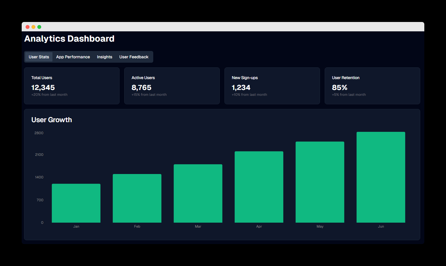
The User Stats tab displays key metrics including total users, active users, new sign-ups, and user retention rates. The bar chart visualizes user growth over time, showing consistent month-over-month increases.
KPI cards at the top provide at-a-glance metrics with percentage changes to highlight trends. The module is designed to give product managers immediate insight into user acquisition and retention performance.
Interested in similar dashboard solutions?
I can help you build custom analytics dashboards and data visualization interfaces for your business.